Leaving aside the fact that the joke here is one that I first made when I was about eight years old,*** what we seem to have is a very, very sparse situation stretched out over far too many panels. Hell...this gag could fit into one panel.**** It is a terrible joke, but even so, it would be funnier if it were shorter. As it is, I had a hard time discerning the point of the comic. The filler panels are especially egregious, as they have absolutely no reason to be there.
This Hagar comic is therefore drawing on the medieval tradition of the really bad verse romance. Not only is it far too long, it inserts its filler so clumsily that the cartoonist may as well be waving vigorously and screaming, "Hey, look! Filler!" Its plot is clumsy and nonsensical, and it ends with a line that is meant to be clever but would not know cleverness if it met some in the street. The effect is very much that of the anonymous romance churned out by an unrepentant hack.
Someone needs to take Mr. Browne's Ctrl-V function away from him before somebody gets hurt.


*I have made him French because Lucky Eddie calls him "fancy-looking," and he is not drinking beer. It is amazing how anti-French stereotypes have lasted for hundreds upon hundreds of years.
**To be fair, a lot of Sunday strips involve two throwaway panels that certain newspapers don't use; cartoonists need to ensure that their jokes will work without them. To be less fair, there is absolutely no reason that the throwaway panels can't actually be funny.
***I mean, who hasn't? When your parents are drinking "dry" wine, of course you're going to make a crack about it being wet. You're eight. That's just the way your brain works.
****Bartender: Here's your dry martini, sir. Lucky Eddie: Gosh, I don't know; it looks awfully wet.*****
*****Or even just...Lucky Eddie: Barkeep! I asked for a dry martini. This one's wet!
10 comments:
Kem, protip: when putting text over a picture, use Photoshop's "stroke" effect on the text layer to create a border of black or white around the text. Helps readability.
Oh, hey...you're totally right. I always forget about "stroke." The problem is that I can't figure out how to make it work on the text layer per se; I end up having to highlight every damn individual letter. Is it possible to do it in another way? 'Cause highlighting every damn individual letter is a wee bit time-consuming.
I'll see if I can fix the comic. It may be too late for it this time, however.
In Photoshop 7, at least, there's a little curlique-F icon (the Adobe Flash icon, as a matter of fact) in the layer box, which brings up a little menu when you click it. "Stroke" is one of the layer effects in that menu; doing it that way should (in my experience, at least) outline all non-transparent areas on the layer.
Okay...that's a bit better, at any rate.
Alas, I'm using Elements 5, which does not have that option. However, I'll look around and see what I can find. Thanks for the tip.
Here's what I can find on using the stroke effect in Elements. Looks like it works on whatever you have selected, so assuming the "select all" function in Elements works like Photoshop's and selects only solid areas, it should work about the same.
The "select all" option selects everything in the layer: i.e., if you use it with "stroke," it allows you to put a border around the entire image. I can't make it work in the way you suggest. The only thing I'm going to be able to do is use the "similar" function, and that will only work if the font in question is not the same colour as anything else in the image.
Ah well. Elements is a little bit non-functional in some areas, and I expect this is one of them. If there's a way to select all the solid areas in a layer--which I suspect there may be--Elements is hiding it from me. It does that.
I think part of my problem is that I'm just a little bit scared of Photoshop.
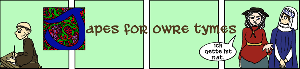
Okay, I feel seriously stupid asking this, but I can't quite figure out what the interstitial text means....
ond ther thei satte yn that oon stede.
lette hem nat wyte lyk flour yn mede!
I read that as: And there they sat in that one place. Let him not white like flour in mead? My second sentence no verb! Clearly I've missed something.
You're close, Brian...but your missing verb is, in fact, "wite" (witen: to go away, die, wilt, wither). The only other words you're mistranslating are "hem" (them), "flour" (flower), and "mede" (meadow). The full translation is thus:
And there they sat in that one place.
Let them not wilt like flower in meadow!
Yes, it's "flower," not "flowers." "Flour in mede" was a fairly common Middle English filler phrase.
Thanks for the pointers. Clearly I need to study this blog more carefully.
Post a Comment